“New Hollywood” refers to an era from the late 60s through the early 80s, when directors exercised near-total artistic control over their films. Films from this period include many of the all-time greats such as The Graduate, Cool Hand Luke, The Godfather, & Apocalypse Now. I don’t deny that many of these films are indeed great, however, I find myself reluctant to re-watch them for some reason.
This is the reason:
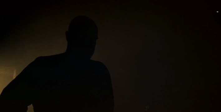
Apparently, back in the late 70s, directors thought it was Kool & the Gang to shoot all their interior scenes to be reminiscent of a power outage at 2AM. This was “atmospheric” and conveyed a “dark” view of the world, unlike those bullshit optimistic Jimmy Stewart flicks from the 50s. As a result, a lot of these “New Hollywood” films look like murky piles of shit where you can’t tell what’s going on. The Godfather is a fucking Iliad in terms of plot, but the visuals are just floating heads or obscured silhouettes in pitch black rooms for 4 and 1/2 hours (approximately):

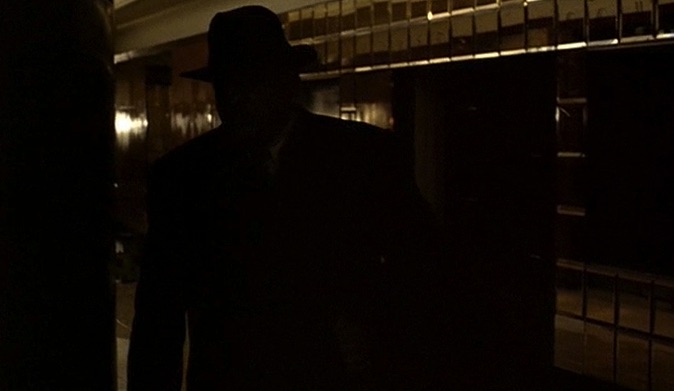

As a result, it’s hard to follow the plot of The Godfather the first time you watch it, because there are 80 characters moving about in total darkness. It may as well have been a radio play because of how Coppola shot it, the visuals are almost worthless. Eventually, on the fifth or sixth viewing, you can follow James Caan’s floating head in a room of darkness vs. Al Pacino’s floating head in a room of darkness, but the film is not exactly what we’d call accessible. This is probably why most women don’t like it. Watching it for the first time is strenuous, and I say that as someone who deeply respects the film.
This is not just Coppola, other directors and other films from this era suffer from the same dark interior problem:
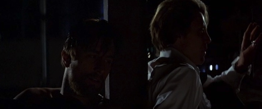

The visuals from these New Hollywood films have aged about as well as Gerald Ford’s campaign slogans. Many of them can be found on any critic’s list of the best films of all time, but compared to anything from before or after, the interior shots look like total shit. Was this because of the energy crisis my Dad told me about ? Did they have to turn off all the lights inside at the same time they had to drive 55?
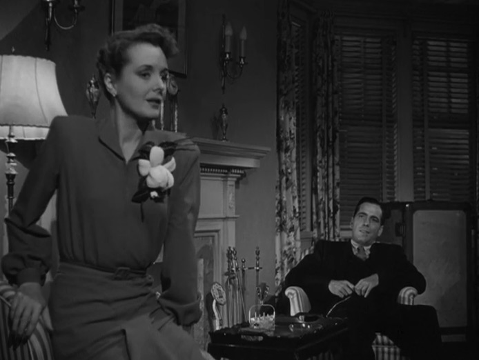
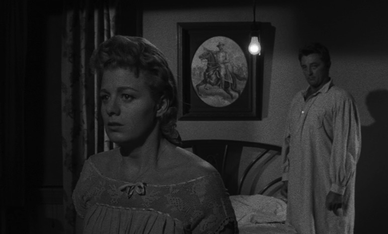
I think these dark visuals were an attempt to imitate Film Noir. The problem is that the black and white images of Film Noir don’t translate well to color. As a result we get these terrible looking shots to convey a “dark” atmosphere. The Noir films from the 40s & 50s did indeed use darkness and contrast to convey mood, but the result is so much better than the muddled darkness of the 70s. Mostly because we can still see what’s going on:

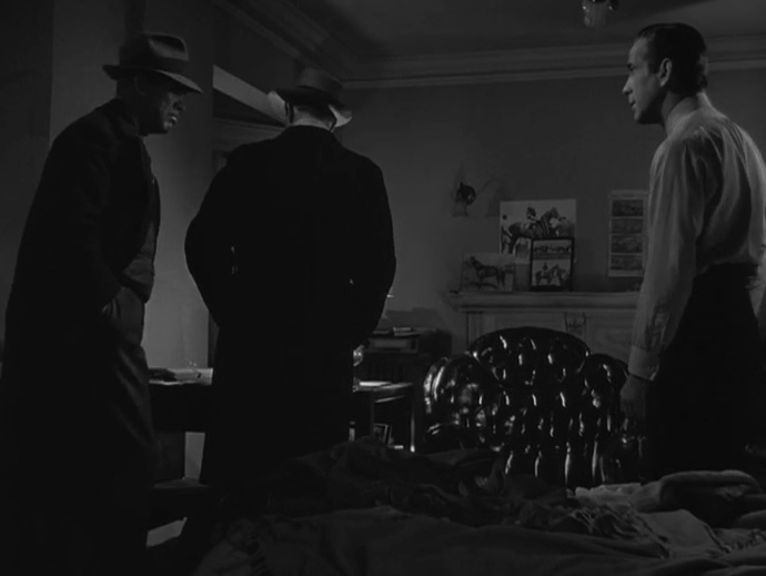

These films use darkness and contrast to establish mood, but the darkness never detracts from the clarity of the composition. Scenes that are predominantly dark still use backlighting to highlight the characters. These characters are usually people we’ve seen in full lighting earlier, and they often have distinctive silhouettes that let’s us pick them out in a dark scene, i.e. in this shot from The Magnificent Ambersons (1942):

The dark scenes are used sparingly, rather than predominantly. Additionally, during interior scenes, even when there’s an air of menace present, you can usually still see character’s faces and understand what’s going on. You don’t need to turn off all the lights to make a scene “dark”. Compare the brilliant clarity below to The Godfather‘s interiors. Both of these scenes use full views of the characters, including body language, composition, and facial expressions to convey what’s going on. You lose that in the 70s New Hollywood style of filmmaking with all the lights turned out.
The New Hollywood directors were undoubtedly influenced by the noir films of earlier decades, but the high-contrast black & white shots of noir didn’t translate well onto color film. The result looks very poor and makes these films hard to follow in terms of plot and character. By comparison, the noir films are easier to follow and look much better than these later films produced in the era when the director was the god of the studio lot. I wonder if in a few decades (after the baby boomers finally die) we will reappraise the films of the New Hollywood era, and take away a few points for the impenetrable dark scenes that look terrible in retrospect. Fortunately, this period didn’t last, and anyone shooting a film like this today would receive their well-deserved criticism for it.
Images contained herein are intended for purposes of criticism, analysis, and education deemed as “Fair Use” under 17 U.S.C. § 107. All images are copyright to their respective owners.
